
The Story
Friday, July 31st, 2026. Sal shows up at my place in the evening, laptop bag over one shoulder, having driven up from Georgia for a weekend to hangout and visit family. I don’t fully know it yet, but by the time he heads back to Savannah on Sunday morning, I’m going to be a business partner on his latest venture.
“Alright,” he says, dropping onto my couch and opening his laptop. “Tell me what you think.”
What I’m looking at is a dashboard. Not just any dashboard. It’s the beginnings of an entire operations suite — CRM, content management, email and SMS marketing, a stack of integrations, all of it built to run a small business without fifteen different subscriptions duct-taped together. Sal has been building this alone for the better part of a year, teaching himself agentic development along the way. It’s the kind of quiet, obsessive, I’m-just-going-to-go-build-the-thing project that only he pulls off. The concept—though rough around the edges—is genuinely good. It’s the kind of good that makes you a little uncomfortable, because you already know exactly what’s coming next.
After he finishes showing me what he has been working on, he says “Yeah man, I’m pretty much bearing my soul to you right now. Honestly, my goal is to see if you want to work with me on this?”
Sal and I have sixteen years of history at this point. It’s a friendship that started when I was 21, and it’s carried us through trying to be musicians together, and running a two-person agency for local bands that we probably shouldn’t have run the way we ran it. Years later, it carried us through building a mold-contamination reporting tool for the U.S. Army, a project that got its funding pulled the second the political winds shifted. We know exactly what it looks like when the other person has actually built something. This was that.
“I’m in,” I told him. “But we have a problem, and I need you to hear me out before you get defensive about it.”
He already knew what I was going to say. The product, and the company, were both called DoobieSoft. Yes. Doobie—like “smoking a doobie”—Soft. I want to be extremely clear that I am not making this up. A grown adult man with genuine, elite-level engineering chops named his AI operations platform this, apparently without a single moment of hesitation.
“Here’s the thing,” I told him. “It’s not about whether you’re comfortable saying it. It’s about whether some middle manager is comfortable saying it out loud to his boss in the C-suite. ‘I think we should switch our whole ops stack over to DubieSoft’ is a record-scratch sentence. Nobody survives that meeting.”
He laughed, rolled his eyes, and, to his enormous credit, didn’t argue. We spent that whole Friday evening doing what two people with sixteen years of creative history do when they’re handed a blank slate. We ran names past each other through Claude, ChatGPT, and Gemini, whatever would generate ideas fast enough to keep pace with how fast we were rejecting them. Meridian. Polaris. Bonfire, which we loved right up until we discovered it was already occupied by roughly nine other tech companies. Lattice. Hyperion. Tessera. Every name that sounded halfway professional was already somebody else’s.
Then Sal, almost as an aside, said: “What about Benben?”
I liked it immediately, and I don’t say that about names often. Benben is the capstone that used to sit atop Egyptian pyramids, tied into their creation mythology as the piece that caps everything else. It’s approachable, a little cute, and still professional. It’s also exactly what the product does: it caps the chaos of a dozen scattered business tools into one ordered system sitting on top. The CRM, the marketing platform, the scheduling software — all of it, capped. We found out within the hour that literally every domain extension was already taken except .tools, which honestly felt like it was supposed to happen that way.
By the time we called it a night, we had a name, a locked-down domain, and the first rough sketches of a logo mark and wordmark already underway. Saturday, Sal took his daughter out for the day, which meant I had the house to myself, a fresh Bauhaus-inspired wordmark direction, and a pyramid sketch to actually finish. I spent the whole day in Illustrator, hand-refining both. When Sal got back that evening, the logo mark and the wordmark were done. What follows is the rest of the week it took to turn that into a complete identity.
The Team
To someone watching from outside, the way Sal and I actually work together probably looks like chaos. He paces. He shows me random YouTube videos with zero context. He throws out ideas — a font, an album cover, a phrase, a shape — over and over, seemingly at random, hoping something sticks. Early in our friendship I used to dismiss a lot of it, or quietly think some of it was bad. I’ve since figured out that’s just his process: he’s spitballing, offering a perspective, and trusting that I’ll recognize the thing worth keeping when it shows up. When he suggested we look at a Bauhaus-style font because he liked an old Bibio album cover, that wasn’t a directive. It was an offering. It happened to land on exactly the direction I was already circling toward anyway.
Sal’s actual technical pedigree, for what it’s worth, is not the kind you can fake. He’s an expert-level engineer trained at Joint Special Operations Command. Not a bootcamp, not a certificate course — the actual military pipeline. He’s spent the last year building agentic development workflows that most companies aren’t remotely close to running yet. I don’t say that to inflate him; I say it because it matters for how we’ve split the work. He’s on engineering and agentic development. I’m on UI/UX and branding. We overlap, a little uneasily, on sales and marketing. That’s the one place I’m not operating from a position of total confidence, and it’s a thread that runs under this entire project whether I want it to or not. I’ll come back to it.
This isn’t our first project together, and it isn’t even our first branding project together. Sal and I ran a small agency called Trickle Media for about two years, working with local musicians, back when we were young enough to think “altruistic and unsustainable” was a viable business model. About 10 years after that came MCAT, a mold-contamination reporting tool we built for the U.S. Army at the Civilian Military Innovation Institute. That project lost its funding when the current administration went after a wave of military-adjacent initiatives, and we’ve both quietly wondered if it was collateral damage from a broader crackdown on anything that smelled like DEI. We don’t harp on it. But we’ve been burned together before, and that’s a different kind of trust than just being friends.
The Product
Benben was formerly DoobieSoft. And though the name of the parent company was still DoobieSoft at the time of this project, in the present we are actively working towards changing the name of the parent company to Benben. What it actually is: Benben is an AI-powered, modular operations dashboard built for SMBs and enterprise applications. The product features CRM, content management, email and SMS marketing, and a growing suite of integrations, all built to work alongside a business’s existing website instead of replacing it wholesale. Sal built it, from scratch, over roughly nine months to a year, with the explicit goal of selling it to brick-and-mortar businesses, AV and events companies, and logistics-heavy operations. These are the kinds of businesses currently juggling six different logins to do what should be one workflow.
The pitch, in the plainest terms I can put it: instead of a business owner paying for a CRM, a separate email tool, a separate SMS tool, and a separate scheduling tool, and praying they all talk to each other, Benben tries to be the thing sitting on top of all of it. Fewer subscriptions. One system. That’s also, not coincidentally, exactly what the name is doing metaphorically. It’s the kind of alignment between a product’s function and its name that you don’t get to manufacture on purpose most of the time — we got lucky. Then we did the work to make sure the identity actually lived up to it.
The Brief
The scope was, on paper, simple: take a product that already existed and already worked, and build it a name, a logo mark, a wordmark, a font system, and a color palette that could survive contact with an actual enterprise buyer. In practice, a few specific things had to be true by the end of it.
1. It had to be sellable. Not cute-in-a-pitch-deck sellable — sellable in the sense that a risk-averse, non-technical business owner or a skeptical middle manager could say the name out loud without flinching, and could look at the product and believe it was built by people who knew what they were doing.
2. It had to avoid the tell. Every AI-adjacent product right now is running some combination of the same handful of fonts — Inter, Sora, Space Grotesk, Work Sans, Public Sans, Manrope, IBM Plex Sans — and the same two or three color families, usually blue or purple. None of those are bad choices on their own. They’re just so overused in this specific category that a product built on them announces “an AI wrote my brand guidelines” before a user reads a single word of copy. We wanted the freedom to be a little weirder than that, on purpose.
3. It had to stay approachable. This is the tension that ran through basically every decision in this project: Benben’s actual aesthetic instincts lean cyberpunk, a little clinical, a little “biomod facility.” That’s a fun sandbox to design in, and it’s completely wrong if it alienates the exact buyer we’re trying to sell to — a roofing company owner who just wants to stop missing calls, not someone shopping for a piece of speculative fiction.
Underneath all three of those sat an implicit fourth requirement nobody wrote down but that shaped everything: whatever we built had to function, not just look nice. This is CRM software. Color especially isn’t just an aesthetic decision here — it’s load-bearing UX infrastructure that has to communicate account health, ticket status, and system alerts at a glance. Get it wrong and you haven’t made an ugly product. You’ve made a confusing one, and confusing is the one thing that actually loses this kind of customer.
Process
Naming happened first, on Friday night, and it moved fast once we actually sat down and did it. The logo mark and wordmark started that same night and got finished the next day, and this is where I found out I still hate Adobe Illustrator exactly as much as I did twenty years ago.


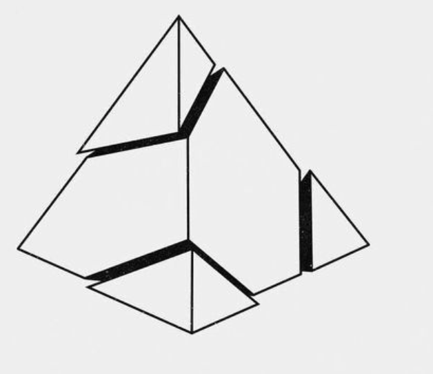



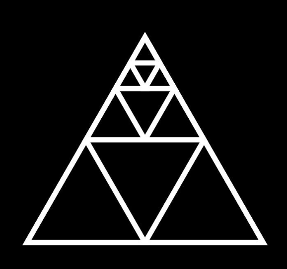

Since Benben is the capstone of a pyramid, the mark had to be a triangle. That part wasn’t up for debate. I fed a pile of vector triangle references into Recraft and iterated through five or six rounds of what I can only describe as complete garbage. Eventually we landed on something worth keeping: a 3D wireframe pyramid with a smaller triangle nested inside it, tip pointing down. We later found out, completely by accident, that a downward-pointing triangle inside an upward one is an actual symbol for introspection and centeredness, which either means the universe was rooting for us or we just got lucky.
Here’s the thing nobody tells you about tools like Recraft: they get you 80 to 90 percent of the way to something usable, and then they just stop. Zoom in and you’ll find warped paths, broken glyphs, artifacts that have no business being there.
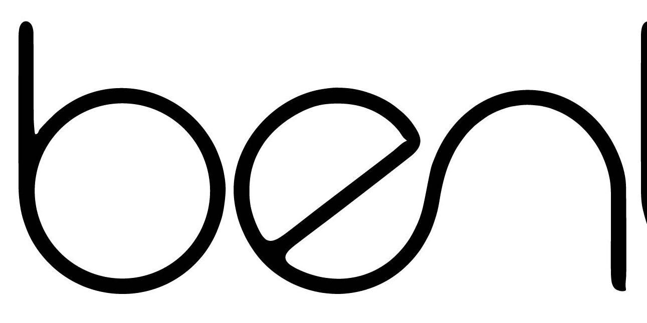
Both the logo mark and the custom wordmark needed to be finished by hand in Illustrator. The wordmark itself is a Bauhaus-inspired lowercase “benben” that I built instead of just typesetting an existing font — I wanted something with actual character, something a competitor couldn’t just screenshot and clone.
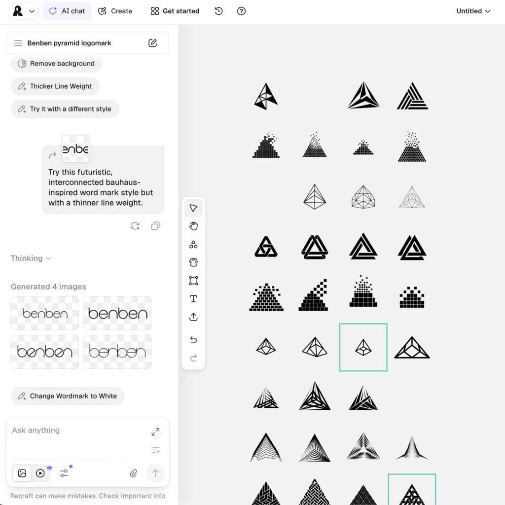
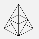
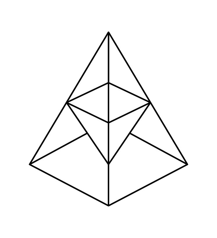
I have tried and failed to get comfortable with the Pen tool at multiple points across two decades of doing this professionally. For reasons I still can’t fully explain, it clicked this time. The pyramid had a perspective error: the inner triangle’s tip was touching the wrong point on the base. That’s the kind of thing that reads as “slightly off” to a normal person and “we drew this wrong” to a designer. I fixed it by hand, tracing one side and mirroring it — and in the process I learned that the original pyramid wasn’t actually symmetrical, but this second run in illustrator did much to address that. The same trick worked on the wordmark, since the name is Ben Ben: tune one half, copy, move it over, paste, done.
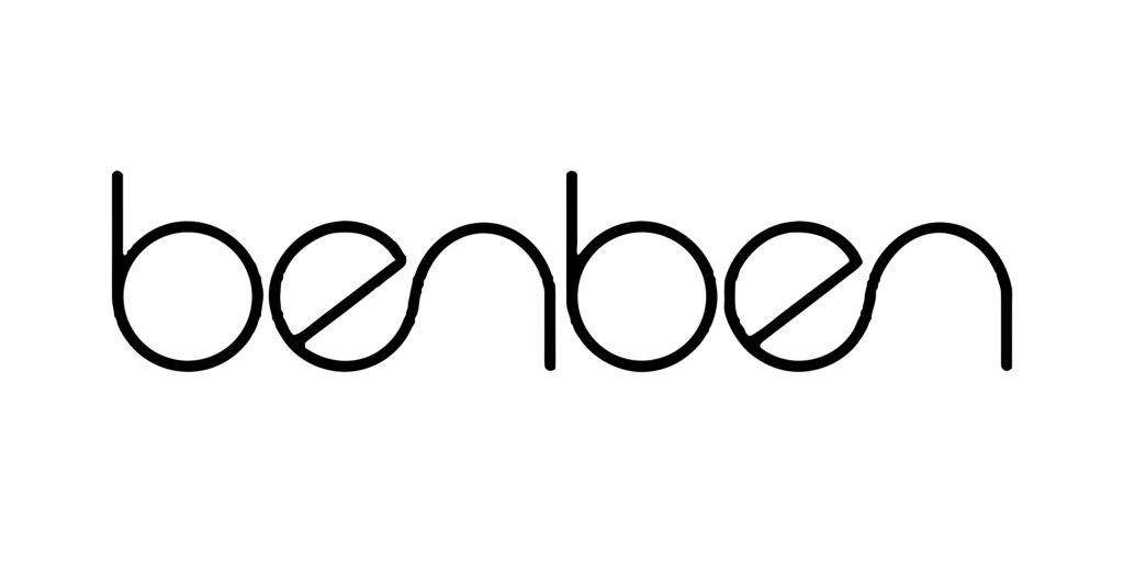
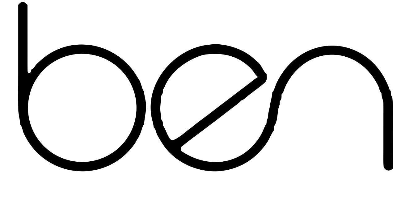
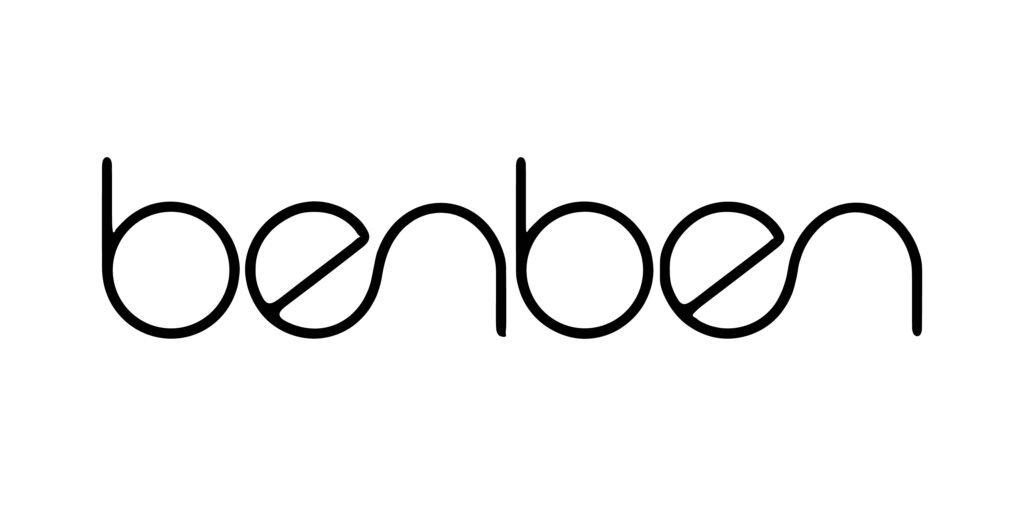
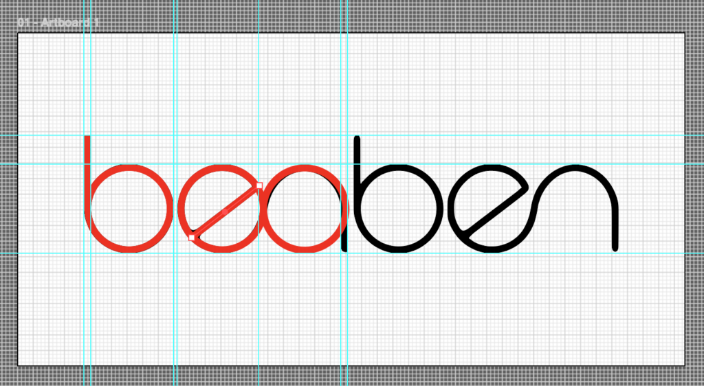
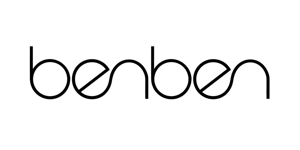
Regarding the pyramid thickness, we landed on a 5-point stroke weight. Sal and I got there independently, before comparing notes, which is the kind of small thing that means more than it should when you’re about to go into business with someone. By the time he got back from his day out with his daughter, both the mark and the wordmark were finished.
Fonts came a few days later, once Sal was back in Savannah and I had room to actually sit with type. This is where I got to indulge the cyberpunk instinct a little, with guardrails. I fed Claude an explicit prompt to stay away from the fonts I mentioned earlier, and got back eight pairings across two rounds — fourteen fonts total.
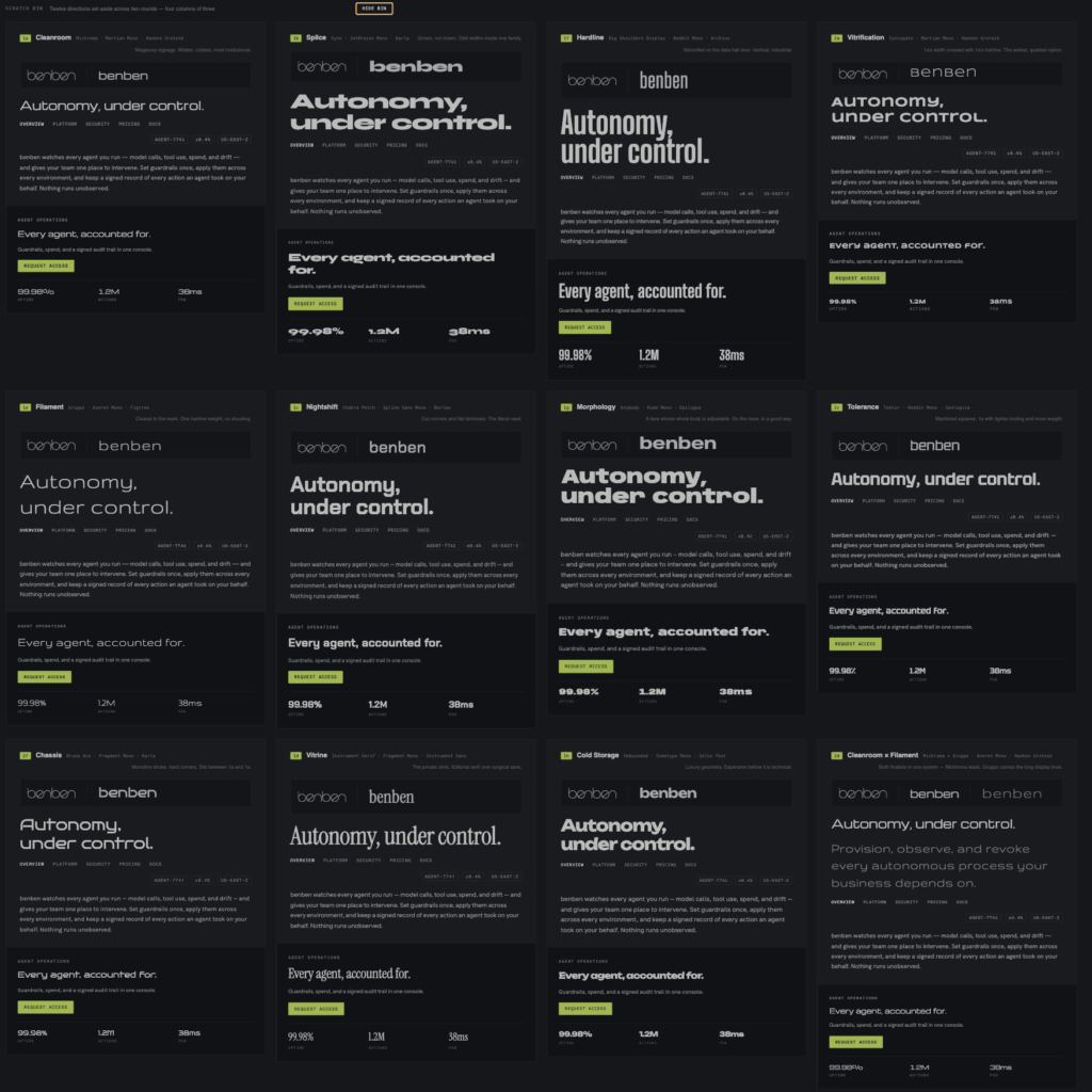
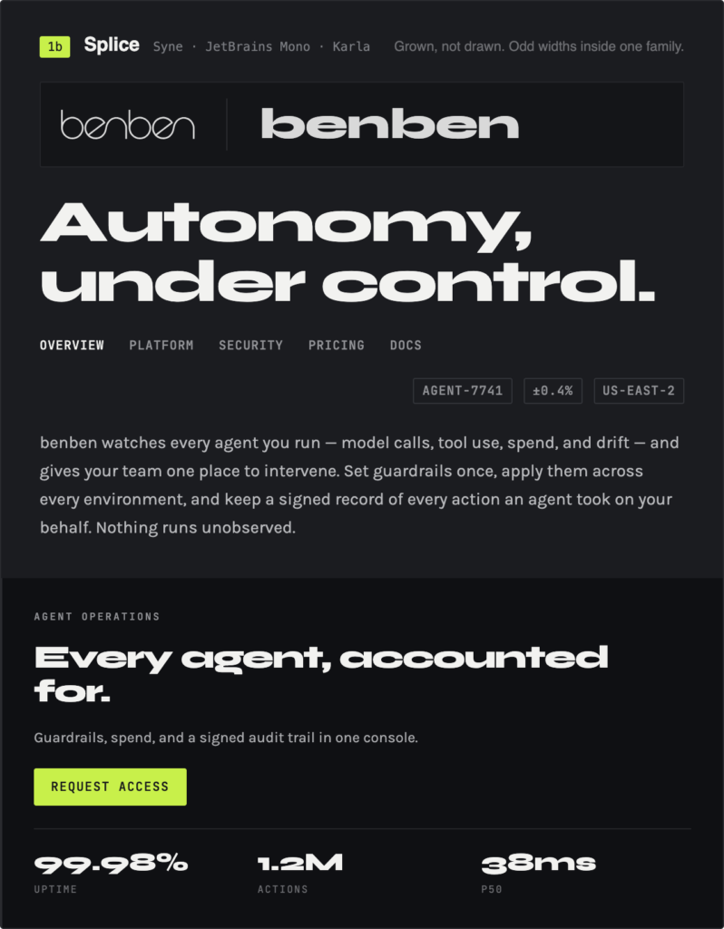
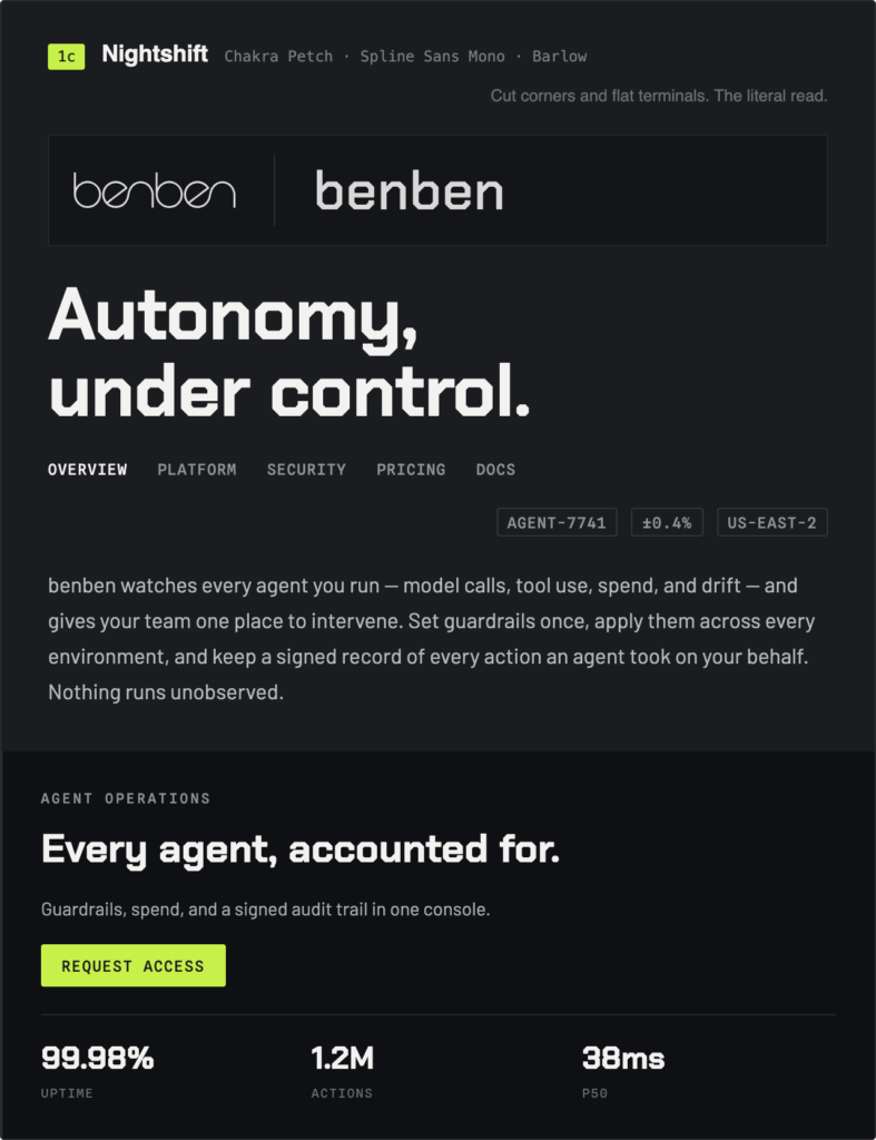
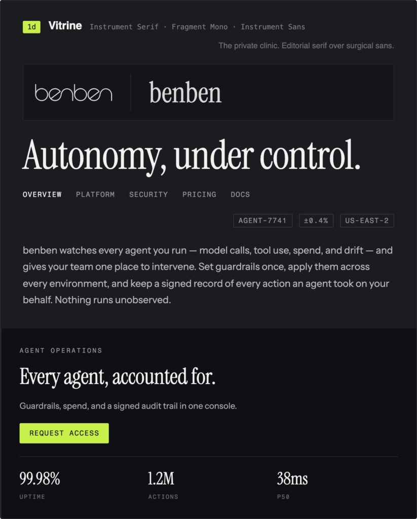
Some of these died fast and deserved to: Splice had numerals where the nine dropped below the baseline relative to the eight, which is an instant, non-negotiable dealbreaker in a product that’s going to display numbers all day. Vitrine, the one serif in the bunch, read less like a futuristic ops platform and more like the waiting room of a private dermatology clinic.
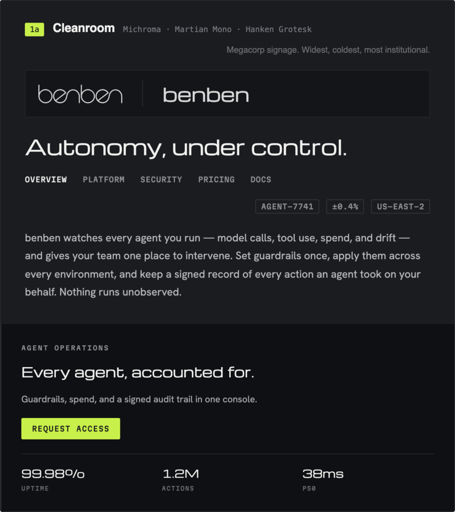
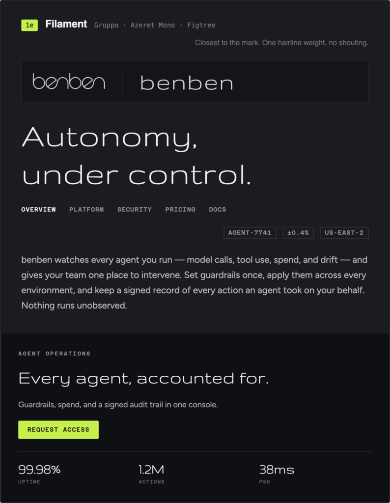
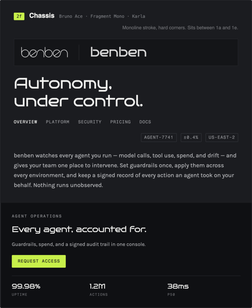
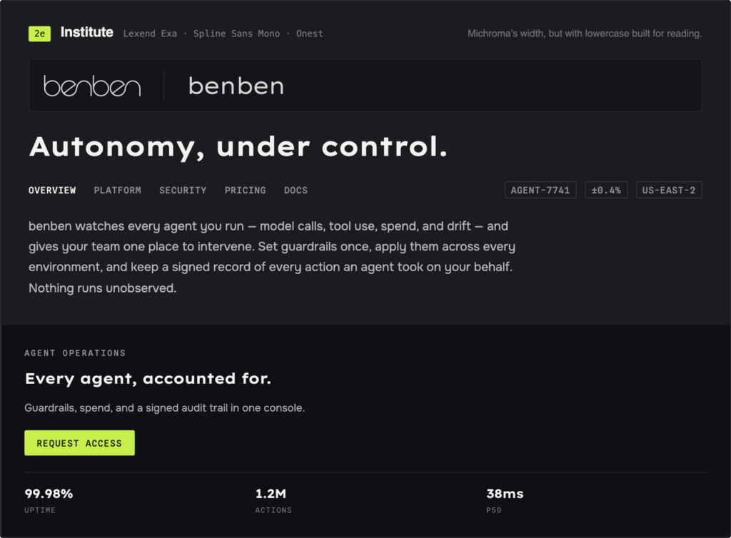
Three fonts arrangements made it to a real final round — Cleanroom, Filament, and Chassis — before it came down to Filament II, built around Jura, against Institute, built around Lexend Exa.
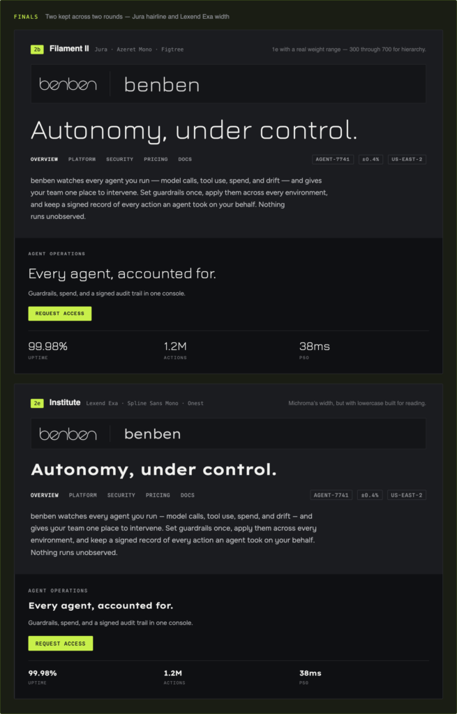
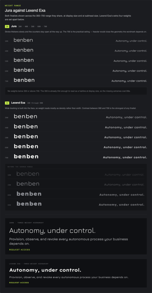
Jura looked sharper and more conventionally “tech,” but it only has about five usable weights—which in my mind lends to less diverse font applications. And this is the part that actually decided it: Jura is quietly becoming its own kind of AI-branding cliché. Lexend Exa has nine usable weights and didn’t come with that baggage. When it came to the winning font arrangement, in the end Institute won.
And then there was color, which took longer than everything else combined. Color in a CRM isn’t decoration — it’s the thing that tells a user, at a glance, whether their business is on fire. I started from a hand-made palette I called Lime Mist, built around the actual slate-gray of the real Benben stone, with a hint of green pulled from photos of the stone under discolored lighting. It was good. It was also, annoyingly, not the last word. A decision this important, one that touches both brand identity and product usability, deserved a real bake-off against alternatives before I let myself commit to it outright.
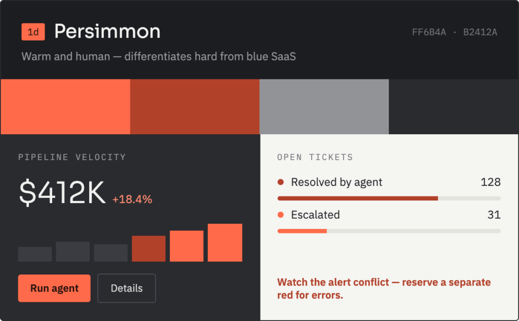
So I generated more. Persimmon was warm and genuinely different from every blue SaaS product on the market. It also happened to read exactly like an alert state, which meant it would sabotage the bird’s-eye-view scannability a dashboard actually needs.
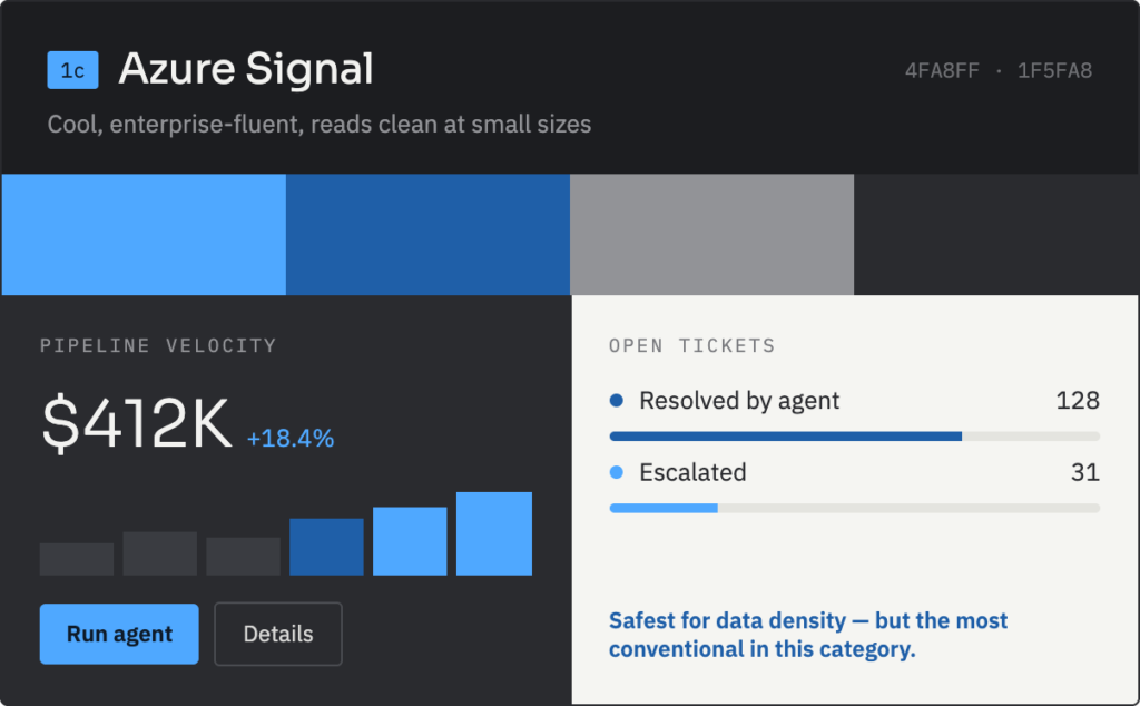
Azure Signal, the traditional blue route, was safe, professional, and completely forgettable. It’s the color equivalent of showing up to the conference in the same suit as everyone else. Iris, all purples, was gorgeous. It was also, at this point, borderline synonymous with “an AI made this,” which is precisely the tell we were trying to avoid in the first place. Clay just didn’t work — Sal thought it was ugly, and honestly, I didn’t have it in me to defend it. And Signal Chartreuse, which I genuinely loved, had to go for a boring but real reason: it’s already the palette for Poolio, an unrelated product in the same portfolio. I wasn’t about to let Benben launch looking like a cousin of a product it has nothing to do with.
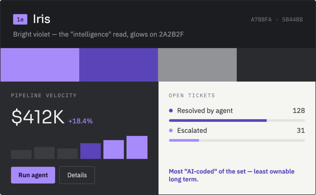
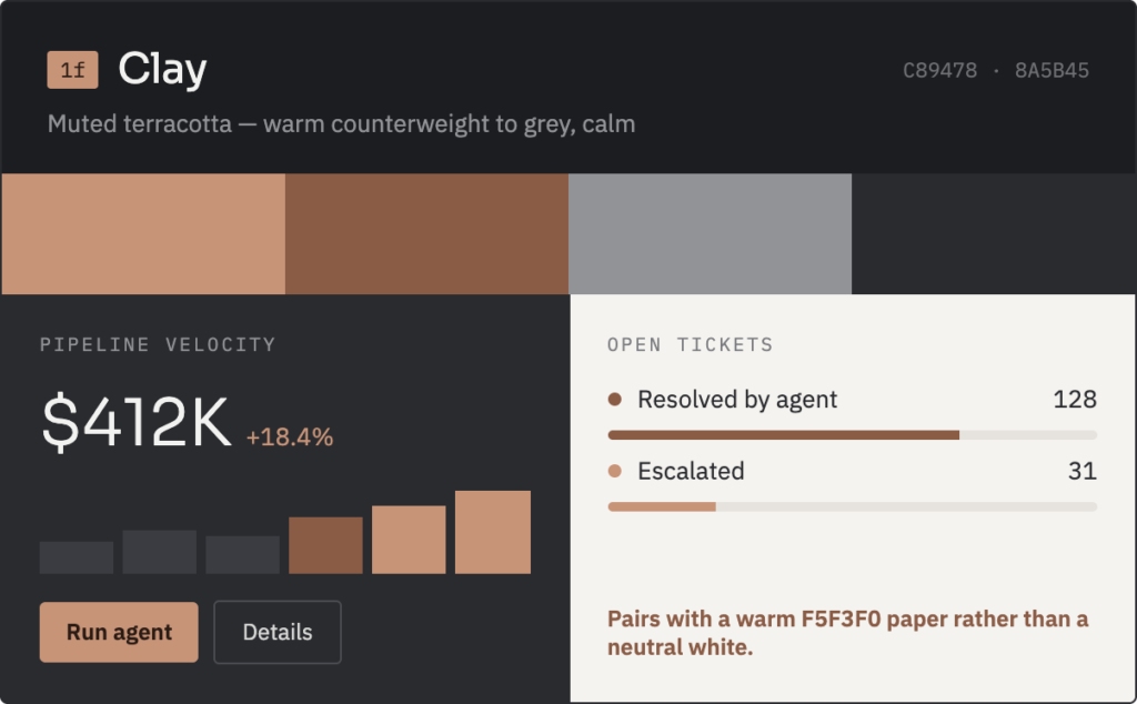
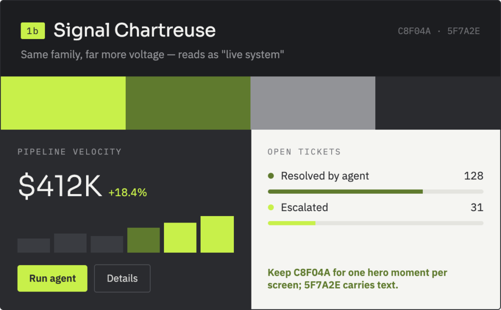
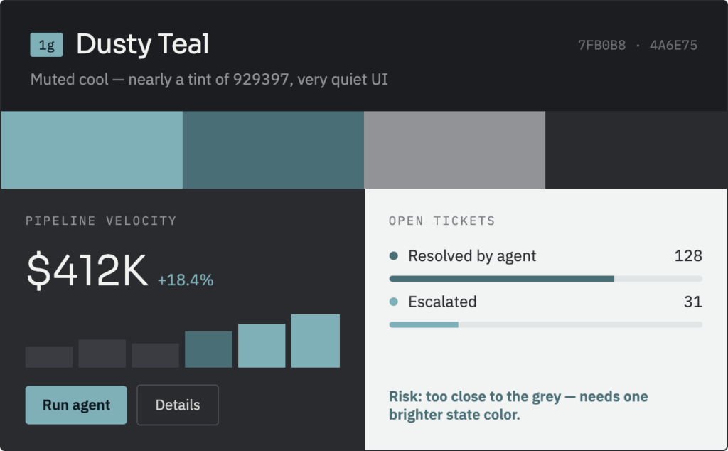
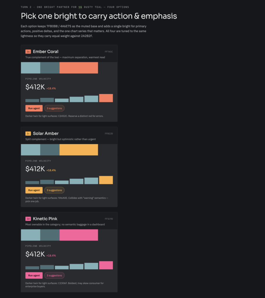
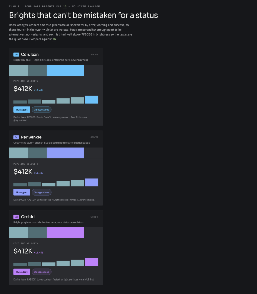
That left a muted teal, Dusty Teal, as the base. Then came a solid week of trying to find a bright accent color that wouldn’t clash with it or with basic UX conventions. I tried Ember Coral, Solar Amber, Kinetic Pink, Cerulean, Periwinkle, Orchid — round after round of technically attractive combinations that, when you actually put them next to a real notification panel, just fought each other.
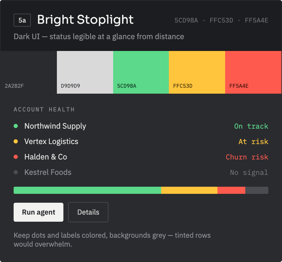
I even stripped every brand color out entirely and built a version that was pure gray and stoplight red-yellow-green, just to see what “purely functional” looked like. It worked. It also had absolutely no personality. Soulless is the word I kept coming back to, and once a design starts feeling soulless, it’s already failed at the one thing branding is supposed to do.
The actual breakthrough had nothing to do with finding a new color. It had everything to do with ending the fight I was having with myself. Instead of treating the brand palette and the notification palette as two systems I needed to reconcile, I tied the primary action color directly to the primary outcome color: the thing you click and the thing that tells you it worked, living in the same color.
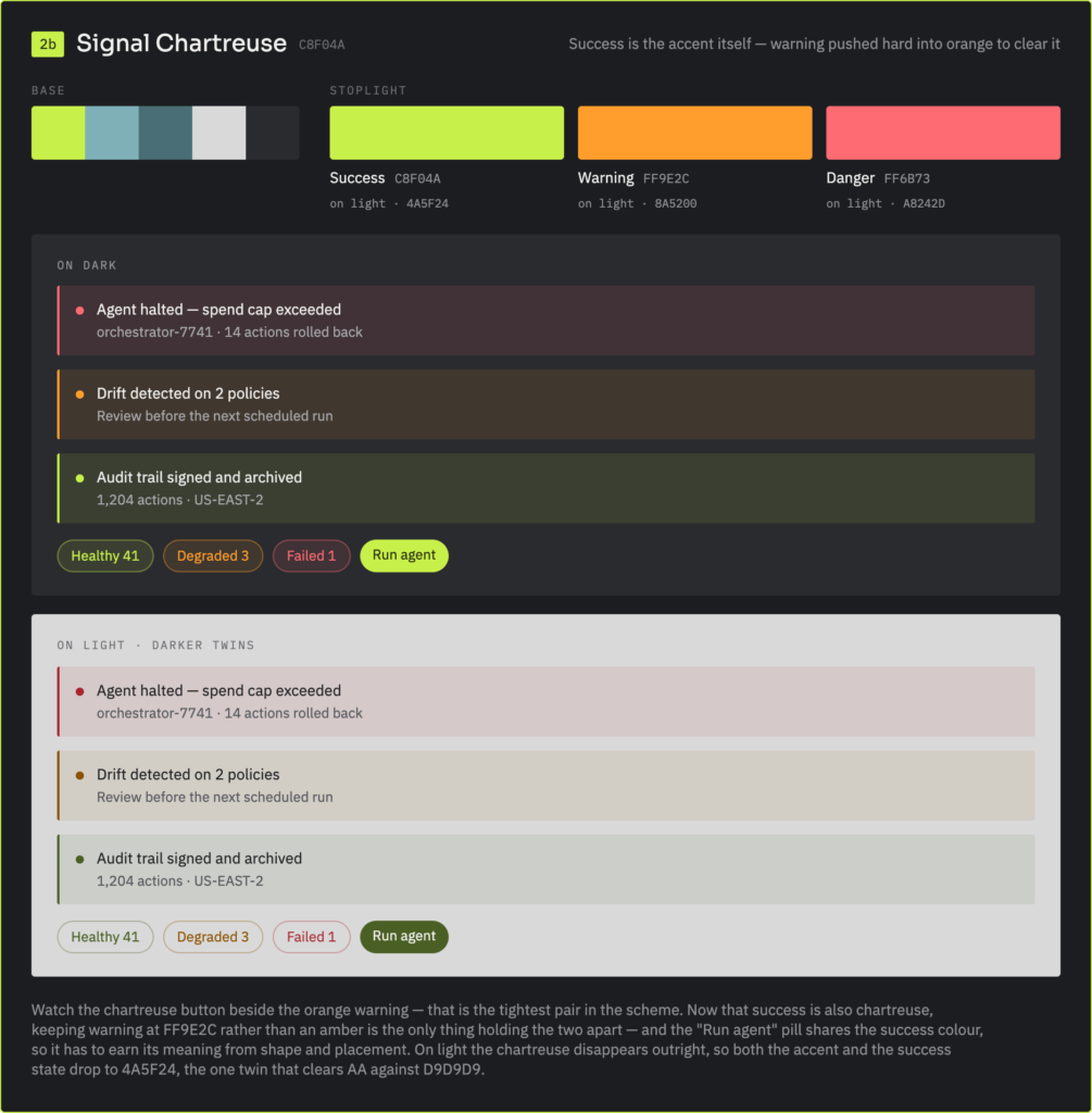
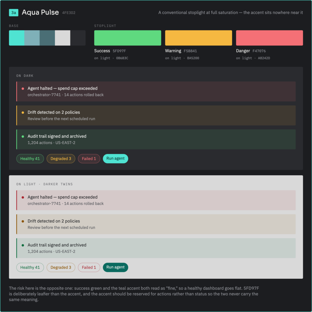
Then I went one step further. Instead of picking some neutral third color to represent “success,” I let the actual brand green, the one built from the real Benben stone, be the success state itself. Spotify’s been doing a version of this for years, reinforcing user actions in the same green that is the entire brand. It’s the kind of thing you absorb by using good products long before you ever consciously articulate it as a principle.
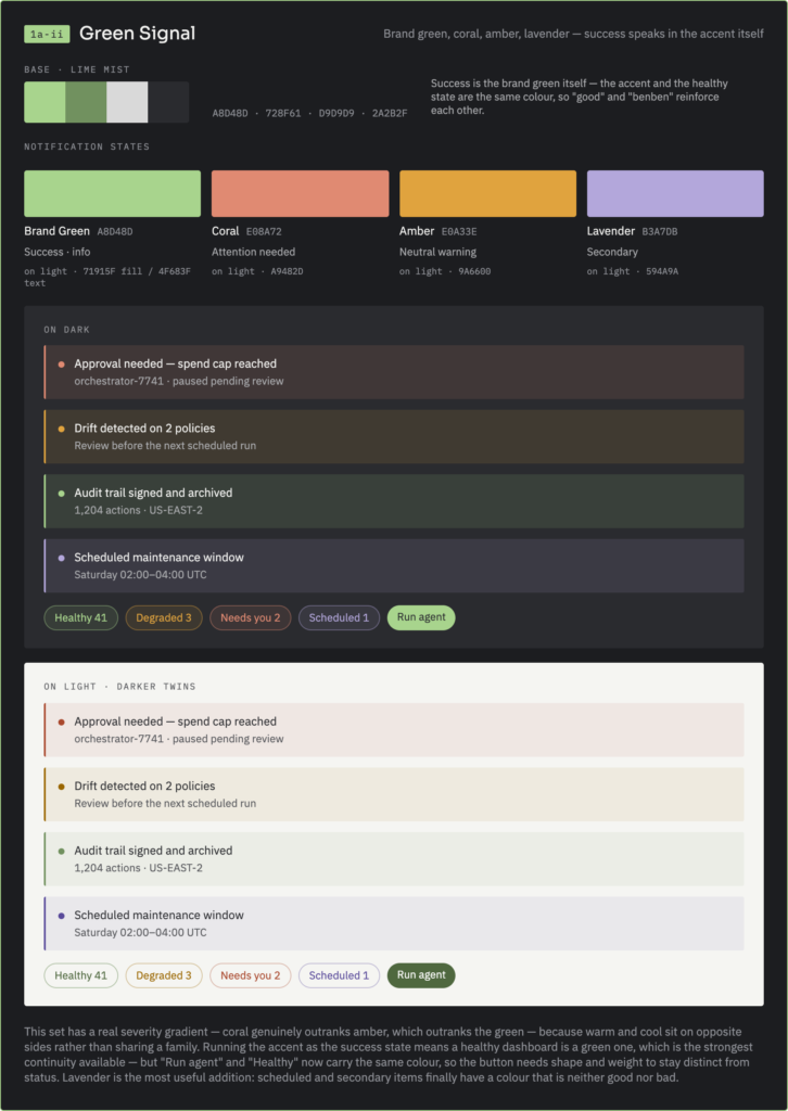
The result, Green Signal, uses that original brand green as both the accent and the “everything is fine” state, with coral for attention, amber for warning, and a lavender I added late for anything that’s neither good nor bad, just informational. It’s muted, it’s calm, and it doesn’t try to give the user an adrenaline spike every time they open the app. I exported the whole thing, every hex value, every type spec, every spacing and radius token, into a proper design tokens file, so none of it lives only as a screenshot somewhere.
Conclusion
If I’m being honest about where I’m proudest in all of this, it’s not the color, and it’s not even the name — even though the name might be the single funniest and most satisfying “we dodged a bullet” moment of the whole project. It’s the logo mark and the wordmark. Naming comes easy to me, arguably too easy, since I can apparently come up with a good brand name faster than I can come up with an actual business to attach it to. Fonts are the same story; I could look at type specimens for a living and not get bored. But logo design has never been my strength, and Illustrator has spent twenty years actively fighting me every time I’ve opened it. Getting a result out of this project that doesn’t feel like it cut a single production corner, on the one tool that’s beaten me the most consistently across my entire career, is the thing I keep coming back to. Sal’s already running the pyramid mark on the company’s LinkedIn page. It’s a small thing, but it’s real, and it’s out in the world.
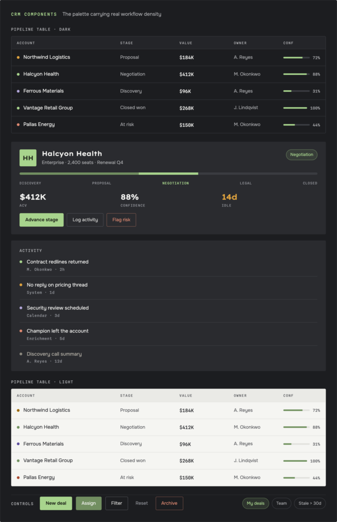
There’s no market data yet. It’s too early for that. What I do have is something arguably more useful at this stage: real conviction, from both of us, that we didn’t just make something that looks nice. We made something that can actually be said out loud in a room full of decision-makers without anyone flinching. That was never a low bar. DoobieSoft, for all its charm as an inside joke, was never going to clear it.
I’ll say this plainly, because I think it’s the actual point underneath everything I just described: branding isn’t a single aesthetic decision, and I don’t think it should be treated like one. It’s a series of tactical calls about how a product is going to be understood, sold, and trusted. The color, the type, and the mark all have to pull in the same direction, on purpose, instead of existing because I happen to like green. There’s a thread running under this whole project: under the naming, the logo, the fonts, the color, and honestly under my entire ongoing anxiety about stepping into a sales-facing role at all. I take this seriously enough to sweat details most people would never consciously notice. That’s not going to change once this becomes an actual UI/UX build instead of a brand identity. If anything, it gets more literal from here.
The brand identity phase of Benben is done. What comes next — actually building the interface that has to live up to all of this — starts as its own project.